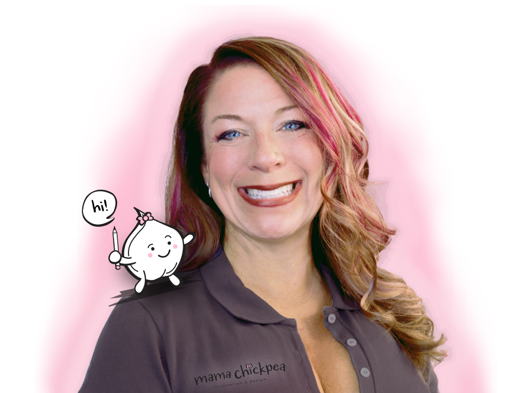
Mama Chickpea Brand. © Shelly Arroyo.
Mama Chickpea Brand
PROBLEM:
Create a new logo and refined branding for designer, Mama Chickpea.
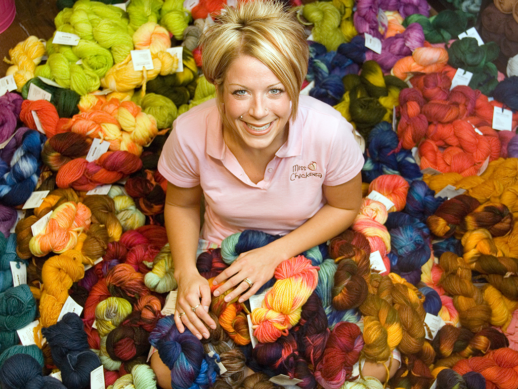
Mama Chickpea started freelancing as a "mama" in 2014. Her nickname, "Chickpea," dated back to the art show circuits she displayed in, in the early 2000s, prior to the start of her studio, Miss Chickpea's Funky Fibers.
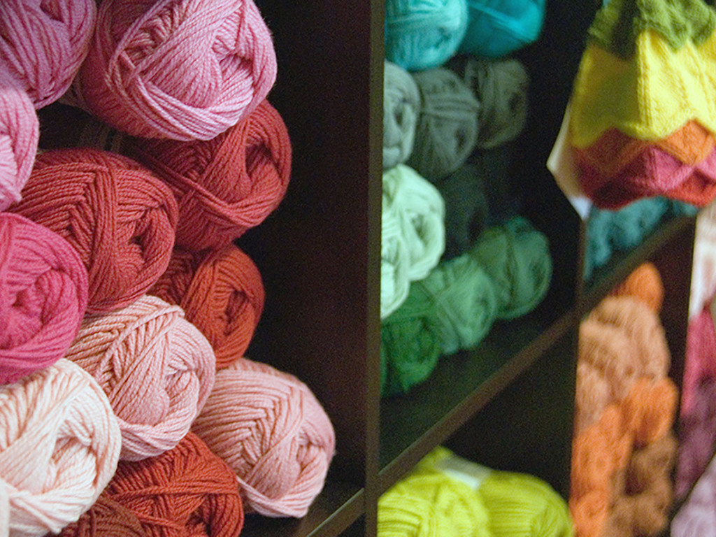
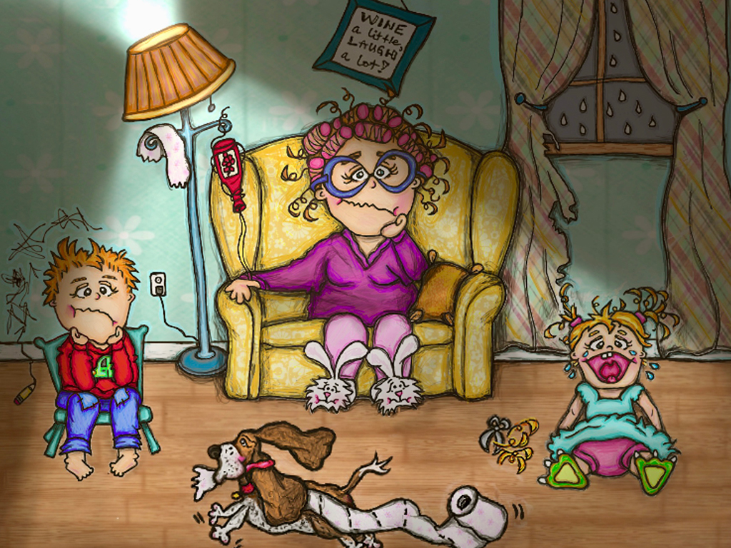
Always playing on the clever name of the chickpea, via its fibrous properties, artist Shelly as Miss Chickpea created a "Mini Pea" character, to help make people laugh and enjoy the brand, which featured art and classes for various fiber arts (knitting, crochet, felting, and weaving.) Clever displays throughout the line have always centered around combining the fiber arts with the food fiber of chickpeas. After the studio had to close in 2010, Miss Chickpea was reborn as Mama Chickpea, to also highlight the various creative hilarity of motherhood.
TARGET AUDIENCE:
Mama Chickpea wanted to attract a broad audience of men and women, roughly ages 18-65, who might desire her freelancing design services. Her clientele often has a sense of humor and unique branded items would help keep the brand memorable.
CONSTRAINTS:
Turn around time for project was roughly two weeks and is on-going throughout the brand's evolution.
TASKS:
Initial audience and content analysis, logo (Adobe Illustrator), and various assistance with other branding items, such as signage or uniforms. Some imagery immediately followed (Adobe Photoshop and Illustrator), for a website (Adobe Dreamweaver) and brand stationery (Adobe InDesign or Illustrator.)
DESIGN RATIONALE:
Color selection included strong black and white design contrast, as well as the feminine color pink. The chosen colorways give the brand a handdrawn presence with the black and white contrast, as well as the feminine pinks in warm tones. Any materials centered around these colors and concept. Since Mama Chickpea was a reboot of Miss Chickpea, the existing mascot character, "Mini Pea," got a redesign, too. Using "Mini Pea" wherever possible, the styling of the stationery also plays on fun humor, a concept that helps to further create fanfare by being very original.
#1 Lesson Learned: "Creating a brand is a very cumbersome experience, especially when keeping an unbiased eye as a designer. Perfecting unified the nuances throughout the brand takes a lot of patience and time. Regular reviews are key to keeping brand standards."
Design Guidance:
The logo for this project was designed to coordinate with HEX values #231F20, #F7B9D3, and #FCE3EB. The font family Monserrat was chosen for its cleanliness and ability to feature several weights for emphasizing, while the font Carrotflower was chosen to mimic handwriting. An image library was created via stock photography chosen for its brand-defining character. Mock-ups were created as necessary for the stationery items.
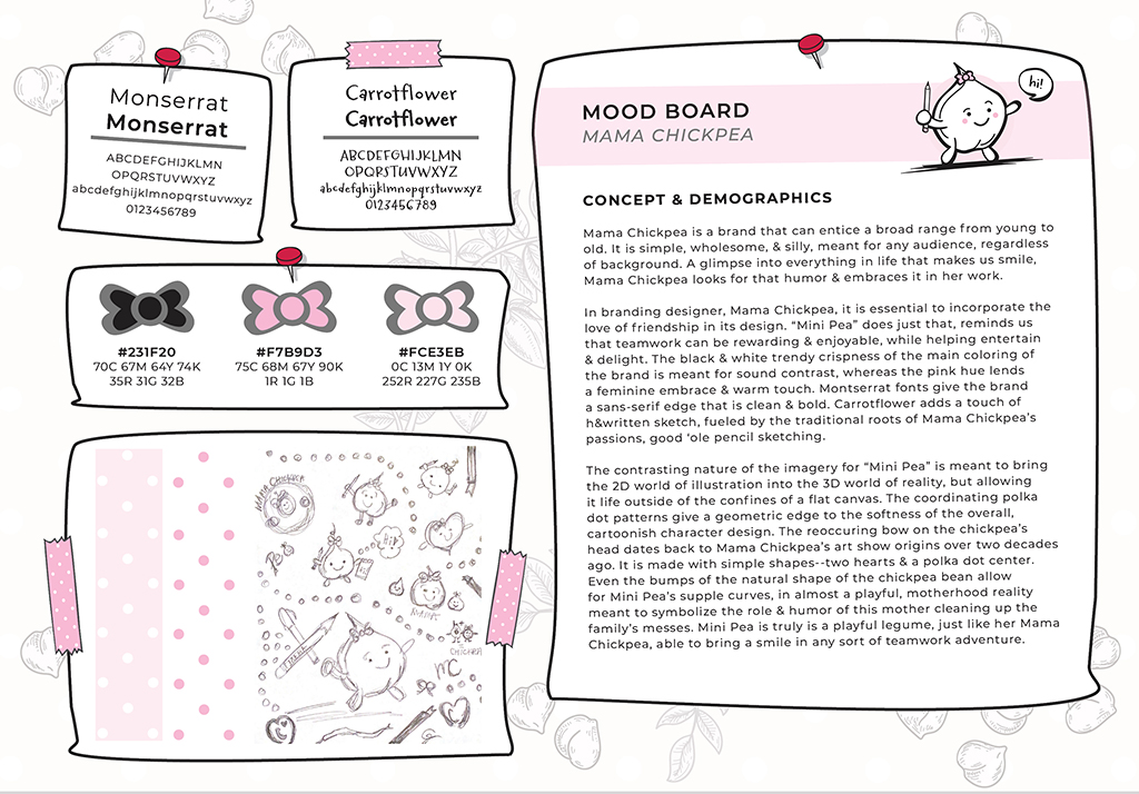
Mama Chickpea Mood Board, © Shelly Arroyo
PLEASE FOLLOW ME as I embark on a quest to enjoy, learn from, and raise my little bamBEANos, in the best way this Mama Chickpea can. Art is my "balance" to life and I enjoy all the DIY therapy I can handle!
Artwork © copyright Shelly Arroyo, A.k.a. Mama Chickpea.