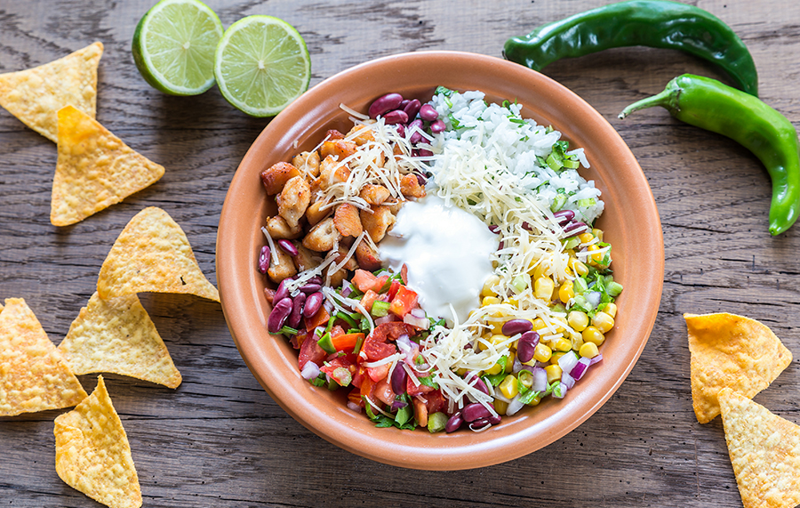
Chicken mexi salad, stock image.
Heuristic Evaluation For Chipotle
When performing a heuristic evaluation of an interface, a UX expert should evaluate a design against a set of supported guidelines that suggest ways to improve usability of that design. For this assignment, I chose to evaluate Chipotle.com, using Nielsen’s 10 Usability Heuristics. The main purpose of this assessment is to provide an inexpensive report of the brand’s website through expert judgment, rather than through user thinking, and to provide usability recommendations for the site. (Talks: Heuristic Evaluation & Cognitive Walkthrough, n.d.) A heuristic approach is considered a “fast and practical” process to solve user problems; however, care should be taken to ensure appropriate response. (What Is Heuristic Evaluation?, 2024) Also, while being a helpful tool to quickly assess usability by a UXD expert, a heuristic evaluation may be more effective when performed early in a product’s development. (Talks: Heuristic Evaluation & Cognitive Walkthrough, n.d.)
When looking at Chipotle.com, three main user goals appear: to allow customers to order customizable orders online, to encourage customers to make accounts and collect rewards points, and to provide an easy way for new and existing customers to view their menu line in its entirety. The Chipotle brand centers itself on offering a myriad of customizable ways to alter their dishes, which originated in the characteristic in-person restaurant order line, not through a website. However, online ordering should feel as intuitive as ordering in-person. This website-specific route is likely a more under-utilized asset than in-person ordering at Chipotle restaurants and could offer the brand increased revenue.
When performing the heuristic walkthrough, a severity scale of 0-4 was utilized. A rating of 0 indicates that there was no issue seen. Level 1 indicates a low impact concern and no real urgency. Level 2 defines issues that are minor and can be addressed later; however, these notes may improve usability through increased user activity and less frustration. Level 3 defines issues that are moderate and should be investigated as soon as possible. Level 4 indicates urgent changes due to critical errors and should be addressed immediately.
When performing this evaluation, Chipotle.com performs well. The brand has sound identity in its visuals and hierarchy of page layout. The navigational labels seem universally understood and menus are found in standard places without errors, such as the global header and footer. There are multiple ways a user can start to order what they need and the imagery helps direct them throughout the process. They have an accessibility option that can be turned on or off for their site, which at face value seems to be helpful for usability, although on basic walkthrough, some features were not affected by turning this accessibility option on or off and could be improved. Many of the site’s heuristic issues were level 2, with no critical level 4 errors found, as indicated on the attached table defining each heuristic standard for the website.
In my evaluation, a couple of recommendations stood out for the brand. First, when arriving on the homepage, it is clear there are multiple areas you can click to place an order which can lead to confusion. Similarly, the Home page is full of different content areas, which may complicate the message and frustrate the user. Second, when making an order, the first step is to select your location from a national map. In my small city, we do not have third-party or delivery options available, only “Pick-Up Here,” and my local store labels were duplicated, incomplete, or confusing. At the cart level of an order, this location confusion is emphasized as double-checking the location for pick-up results in having to reselect the location from the national map level. The location selector should be evaluated further for ease of use and the labeling should be unique for each location.
When customizing a menu item, options can be confusing. Selecting “1/2” options of two items maxes out your selection, whereas you cannot select different combinations if ½ and ½ has been selected. The site does not explain this in any way, nor does it give definitions or nutritional facts for these tailored options. Additional cost options are listed; however, there is no running tally present for you to watch the price of the order. There is no written definition for any of the ingredient labels, only a small photo.
The shopping cart does not clearly itemize the totals that have accumulated throughout the process and there is no dynamic total when customizing an item. Similarly, the shopping cart feature separates different main items that may have additional cost, but it does not spell this out for the individual customized products that could include an extra charge. For example, “1/2 black beans ½ pinto beans” may be listed as no charge; however, it is in small print and paragraph form, along with options that may add additional cost (i.e., Guacamole +$2.95.) Changing the transparency of additional customized item costs in the cart would be more user friendly. This transparency issue may cause some patrons to abandon their carts altogether, which would be detrimental to the brand’s bottom line.
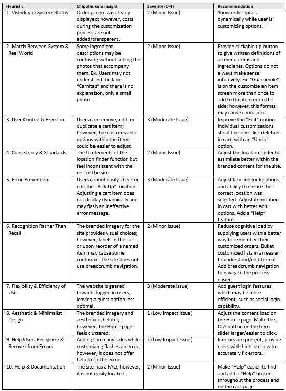
Heuristic table, 2025. © Shelly Arroyo
References
Nielsen, J. (2024, February 20). 10 Usability heuristics for user interface design. Nielsen Norman Group. https://www.nngroup.com/articles/ten-usability-heuristics/
Talks: Heuristic Evaluation & Cognitive Walkthrough: Spring 2025 USER EXPERIENCE EVALUATION FUNDAMENTALS (UX-60541-001). (n.d.). https://kent.instructure.com/courses/104974/pages/talks-heuristic-evaluation-and-cognitive-walkthrough?module_item_id=4804089
What is Heuristic Evaluation? (2024, November 30). The Interaction Design Foundation. https://www.interaction-design.org/literature/topics/heuristic-evaluation
PLEASE FOLLOW ME as I embark on a quest to enjoy, learn from, and raise my little bamBEANos, in the best way this Mama Chickpea can. Art is my "balance" to life and I enjoy all the DIY therapy I can handle!
Artwork © copyright Shelly Arroyo, A.k.a. Mama Chickpea.